Introduction
The “premiership window”, what is it, is it useful, and should you care about it? In short, it’s a historical tool that ranks the footballing prowess of each team on their attacking and defending ability – stretching the points scored for and against metrics. And its use in AFL media as popular analysis has risen!
It’s introduction was in “On the Couch” (2023), a football focused show hosted by Fox Footy (YouTube video of it’s introduction below). Here, Garry Lyon introduces the concept and how Champion Data developed the tool which claimed:
“15 of the last 17 premiers, have been sitting in this window”
The concept was then mentioned 7 more times on the show in 2023, 14 times in 2024, and 36 times in 2025 [1]. Note that the term “premiership window” is also used for a team who is a premiership contender so there may be some overlap here. Nevertheless, the increase in references point to the casual viewer having a growing appetite for the games rich data analytics side.
The tool is being used to highlight premiership contenders; is being referenced more each year by presenters and commentators; and yet, there has been little effort to justify the usefulness of the tool. After all, if a team is great at scoring points, and reducing their opposition’s scoring, it seems self evident that they would be premiership contenders.
In this article I will be:
- describe the tool;
- show the premiership window for each year in the AFL era;
- what it describes for a team at the end of the regular season;
- match-up results for premiership contenders;
- criticizing its concept by looking at ladder position and win percentage outcomes; and
- deriving insights.
Background
The idea behind ranking teams based on their offensive and defensive prowess is not new for AFL fans. Accompanying the ladder, which orders teams by premiership points (four premiership points for a win, two for a draw and zero for a loss), has always been cumulative points scored for and against. The latter is the basis for this analysis.
To create this visual, all you need to do is follow the steps outlined below – click on the “Methodology” below to learn more.
Methodology (click me)
| Step | Visual |
|---|---|
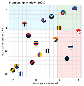
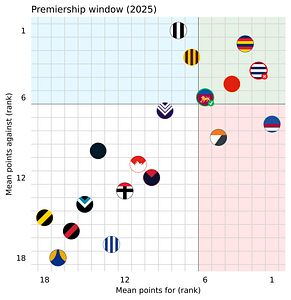
| 1. Start with the ladder from the regular home and away season, this example is from 2024; | 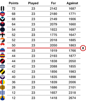 |
| 2. Take the average points for and against per game (to eliminate the influence of teams with with a different number of games played during the season); | 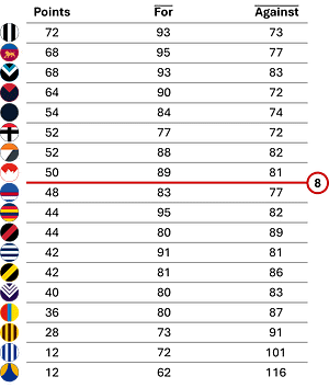 |
| 3. Plot the results on a scatter plot; | 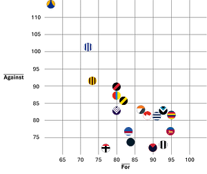 |
| 4. Rank the results from best (1st), to worst (18th); and | 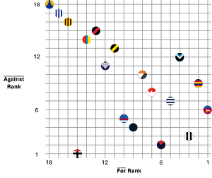 |
| 5. Flip the y-axis to show the best defensive teams at the top, and add indicators (top 6 teams for attack and defense) to the different areas of the chart for the final product. Note, identifying the top 6 is to be consistent with the Champion Data (video in Introduction). |  |
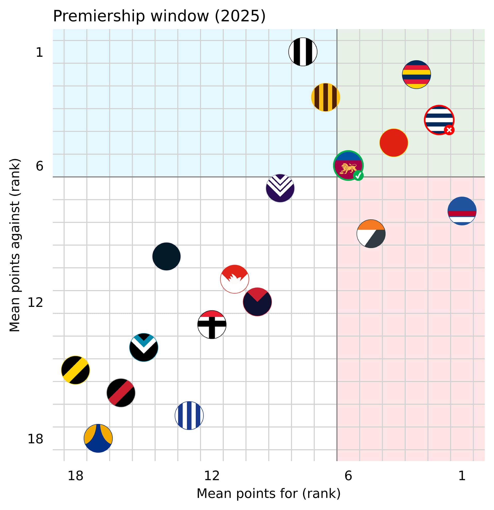
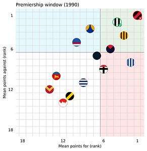
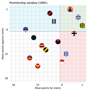
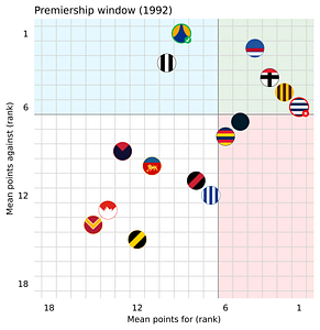
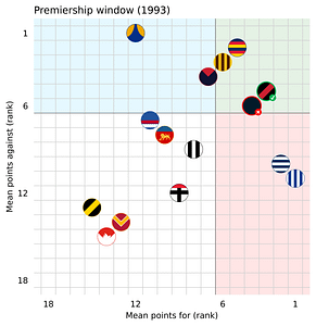
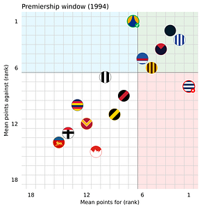
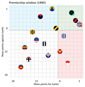
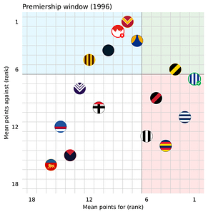
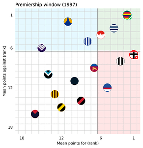
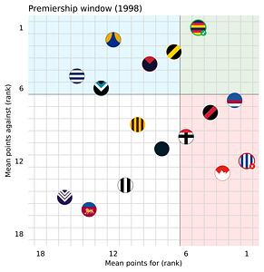
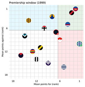
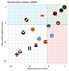
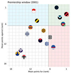
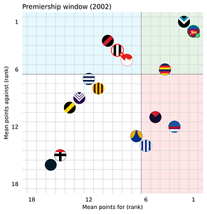
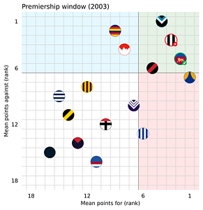
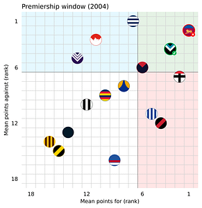
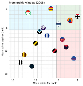
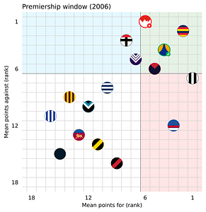
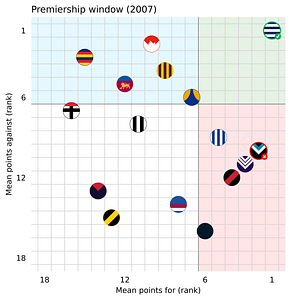
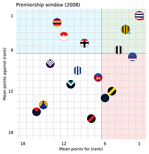
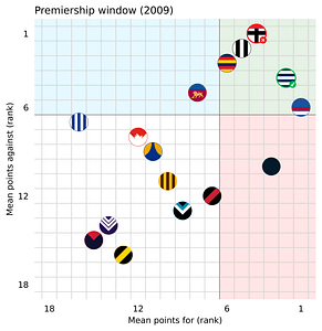
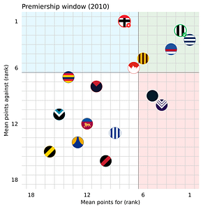
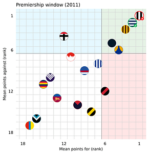
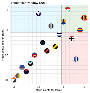
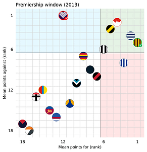
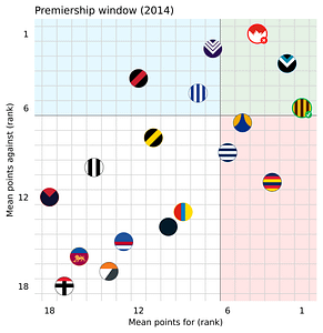
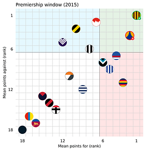
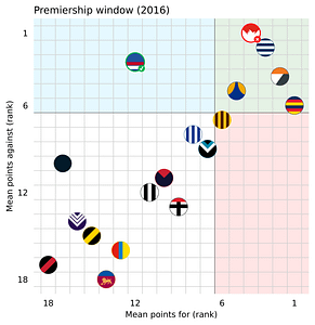
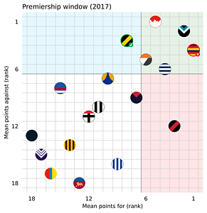
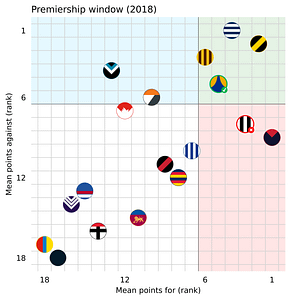
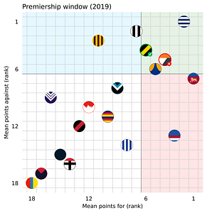
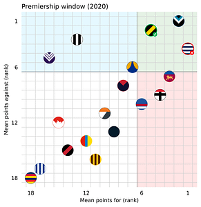
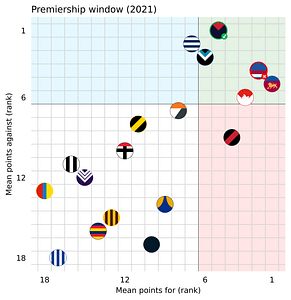
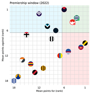
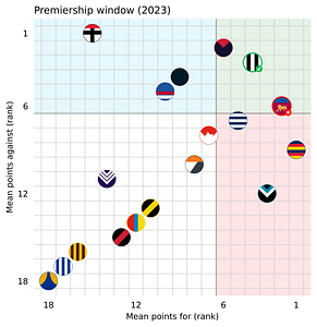
Historical premiership windows (1990-2025)
Click on the decade drop down to explore each years premiership window since the beginning of the AFL era (1990-current) – these also indicate the winner and loser of each years grand final.
The data behind these charts are the foundations for the rest of the article.
Decade:
1990s (click me)
2000s
2010s
2020s
What does being in the window describe?
Finals, Grand Final appearances, premiership titles
I have completed this analysis starting all the way from 1990 (36 seasons), the beginning of the AFL era. I have coloured the 4 areas of the graph describing the top 6 teams for attack (red), defense (blue), and in the window (green) for quicker interpretation, I have also included that colour scheme in the below tables.
By grouping where teams finished on the ladder, with their final positions on the premiership window at then end of the regular season, we see that:
- 21.2 % of teams will sit in the window at the end of the regular season,
- 43.8 % that make it to the finals (Top 8 Finishers) sit in the window,
- 75 % of premiership contenders have sat in the window, and
- 80.6 % of premiership winners too.
So there is truth in the premiership window correlating with club success, as it should. See Table 1, showing the percentage that each outcome will fall in which section of the premiership window.
| Key: | Top 6 Points For | Top 6 Points Against |
|---|---|---|
| Out | ❌ | ❌ |
| For | ✅ | ❌ |
| Against | ❌ | ✅ |
| Window | ✅ | ✅ |
| Outcome | Out | For | Against | Window |
|---|---|---|---|---|
| General | 49.1 % | 14.9 % | 14.9 % | 21.2 % |
| Top 8 Finish | 12.5 % | 21.2 % | 22.6 % | 43.8 % |
| Grand Final Appearance | 1.39 % | 11.1 % | 12.5 % | 75.0 % |
| Premiership Winners | – | 5.56 % | 13.9 % | 80.6 % |
Table 1. Tabulated premiership window outcomes
Grand Final match-ups
I want to go back to this quote from Garry Lyon which claimed:
“15 of the last 17 premiers, have been sitting in this window”
I have broadened the number of seasons inspected in this post from 17 premiers (as quoted by Garry Lyon) to 36 (starting from 1990), so I won’t directly respond to the quote, but I do want to shed some light on how this can be deceiving. With the wider lens, the quote is supported: 29 of the the last 36 premiers have sat in the window (see Table 2). However, 25 of the last 36 grand final losers have also sat in this window. So is it really that useful?
To highlight the point further, let’s look at all premiership game match-ups and where the winner and loser of the game sat on the premiership window (see Table 2 for all match-ups). A total of 21 Grand Final games between 1990 and 2025 have been between two teams that were both in the window. But more notably, 8 games have been won by a team in the window against teams that weren’t, and 4 games have been won by a team outside the window against teams that were (interestingly, only teams that ranked high in defense won these, but with the small sample size of these outcomes it’s nothing to draw conclusions from).
| Loser | Winner | Total | ||
|---|---|---|---|---|
| For | Against | Window | ||
| Outside | 2.78 % (1) | – | – | 2.78 % (1) |
| For | – | 2.78 % (1) | 13.9 % (5) | 16.7 % (6) |
| Against | 2.78 % (1) | – | 8.33 % (3) | 11.1 % (4) |
| Window | – | 11.1 % (4) | 58.3 % (21) | 69.4 % (25) |
| Total | 5.56 % (2) | 13.9 % (5) | 80.6 % (29) | 100 % (36) |
Table 2. Match-up likelihood in Grand Final (with number of occurrences)
I want to go back to my previous point, if a team is great at (1) scoring points, and (2) reducing their opposition’s scoring, it seems self evident that they would be premiership contenders – this is what we are observing when 21 games are between teams that meet these definitions.
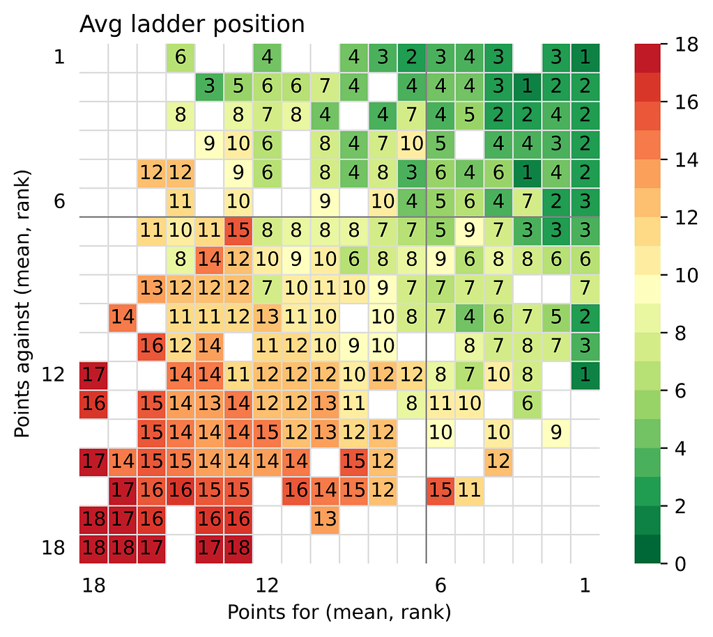
Ladder position
As a data visualisation exercise, I have shown the average ladder position achieved by location on the premiership window on Figure 1. As can be assumed, the closer you are to far corner of the window, the higher the average ladder position is.
Note that Figure 1 is showing 2 images. The image on the:
- left is the average ladder position for each location (average was required to cater for two teams that both landed on that location across the years included), and
- right is a “smoothed” version of the data used to fill in the empty gaps between samples. The smoothing is similar to the blurring affect in photography, “when each pixel in the output image is a function of the nearby pixels (including itself) in the input image” [2].
The smoothing helps to obscure outliers, simplify the image, and make it easier to see the pattern.
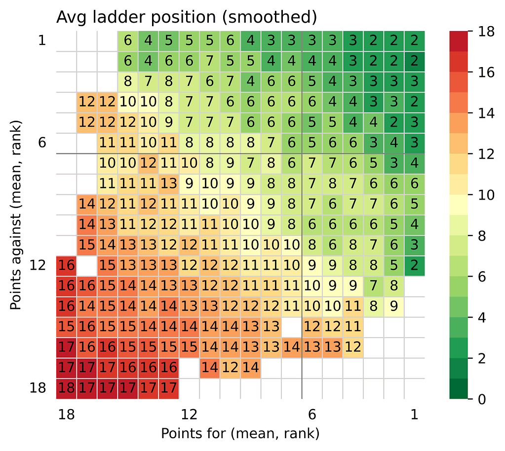
Win percentage
We can take the same approach as we used in the previous section, and see how the location compares to win percentage for the regular home and away season (see Figure 2). A similar smoothed image is shown in the figure.
This helps show whether a preference in attacking or defensive prowess has an advantage in different locations of the graph.
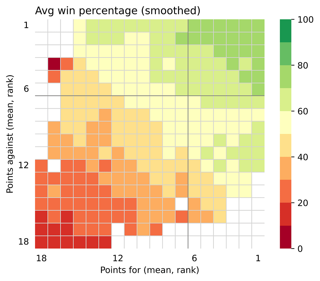
If you are convinced by these results, there is an angle to this visual analysis that you can use to answer if greater attack or defense wins games of football – although, at a very high level. By comparing the defensive position on the graph to the corresponding attacking position (i.e. compare the location with rankings 6th for defense and 5th for attack against the location with rankings 5th for defense and 6th for attack), we can see which location wins more games throughout the regular season.
Figure 3 visually compares the corresponding positions. The smoothed plot was used, as shown in Figure 2 to ensure there were enough locations that had data – if no comparable data was available, then it isn’t shown.
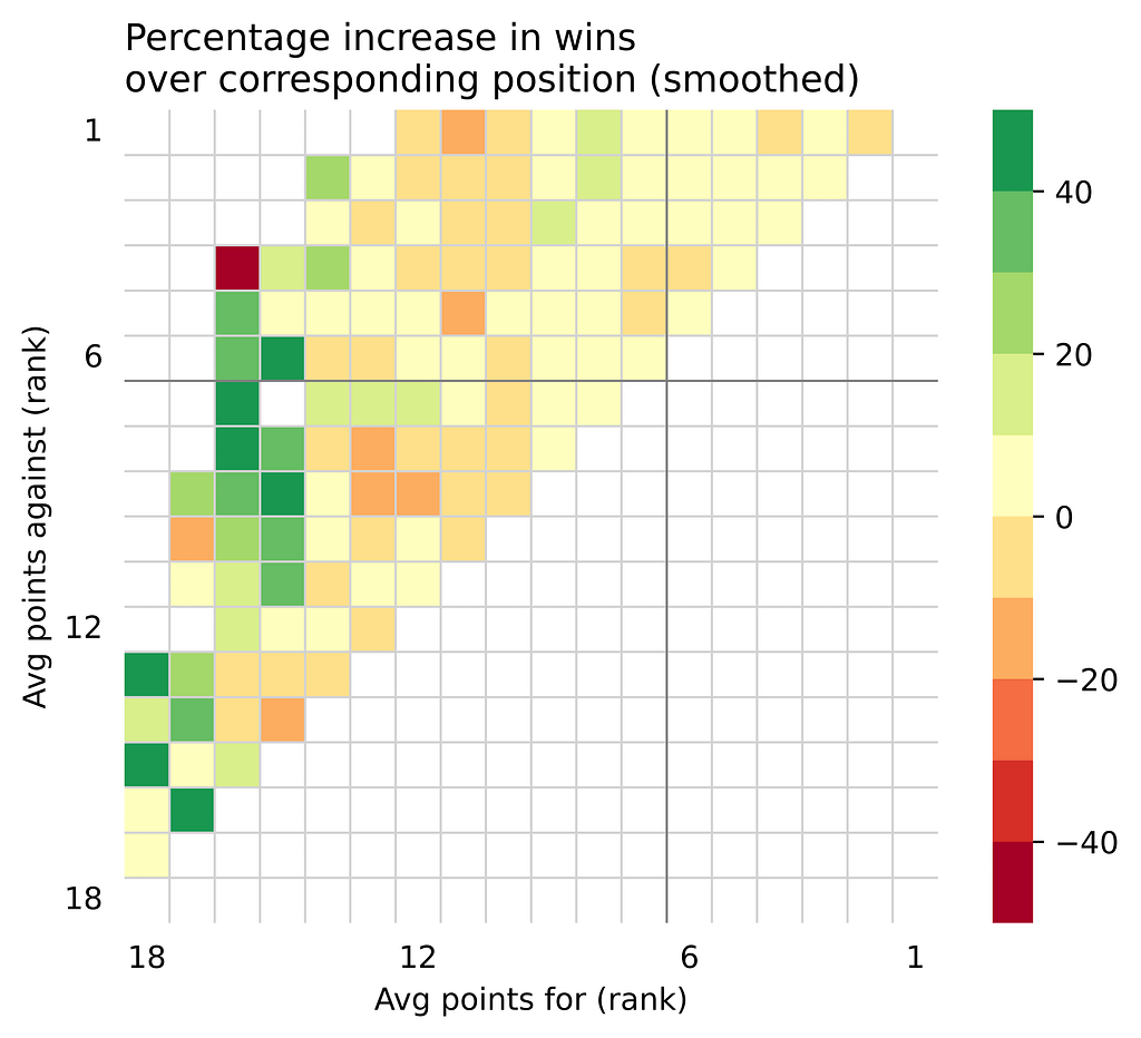
The average of all cells is a 6.74 % increased number of wins, for a more defensive team over the corresponding more attacking. But this is a very simplified outcome.
As Figure 3 shows, this is more nuanced depending on where the team sits. For example, the figure suggests that poor performing teams would benefit by improving their defensive outcomes rather than attacking (see attacking rank 15-18 on the left of Figure 3). This assumes that improving either is a binary decision, not considering if it’s more difficult to improve one over the other.
Conclusions
We have looked over the concept of the premiership window and its usefulness, and seen that what it’s showing is the outcome of each game. More critically, this is a very high level analysis that categorises outcomes rather than categorising inputs (a lagging indicator rather than a leading). The latter, leading indicators, is what analysis should be finding!
Again, if a team is great at scoring points, and limiting their opposition’s scoring, its self evident that they are a good football team.
This doesn’t mean that looking at football this way isn’t fun. It’s fun to see how your team ranked in both attack and defensive prowess historically, and it makes for some pretty charts with readily available data to everyone.
It’s a condensed way to describe how your team saw success one year over another, and tells a very simple story about how these teams were historically coached / where their focus was to win games of football.
Leave a Reply